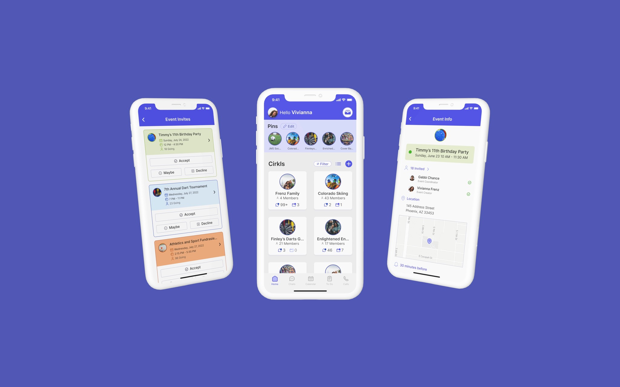
7 Months
Role
UX Designer (me)
Team
Founder
Stakeholders
Development Team
Tools
Figma
Defining Business Goals
Research
Competitive Benchmarking
Version 1.0 - User Feedback
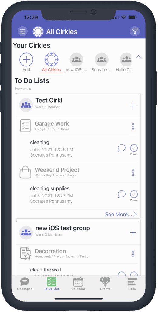
“It’s hard to tell when I’m in a Cirkl and when I’m not.”
“I only use the event calendar because I’m not sure how anything else works.”
“I have to make sure I’m not hitting any of the wrong buttons because I don’t know what they all mean.”
Focus Area - Feature Prioritization
Speaking with users allowed me to to interpret different user motivations
Focus Area
Wireframes
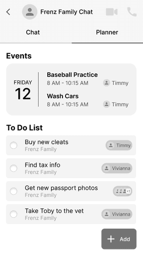
Cirkl Feature - Dashboard
Design Opportunity
Feedback from users
Site Maps
Development
Hight Fidelity UI's
Usability Testing
To make sure the app features are broad enough for different types of use cases, the functionality of the app was tested by six college students.
I created a focus group script to keep the testers on track. I asked them to navigate to each feature; individual chat, calendar, to do’s and calls as well as selecting a Cirkl. I then prompted them to create a new Cirkl and create a new calendar event.
The guiding script I used make sure the usability test went smoothly.
Development - Feedback + Usability Testing
Chat Navigation
3 out of 6 students had trouble navigating between chats.
2 students mentioned that they would like to direct message others members easily within the Cirkl.
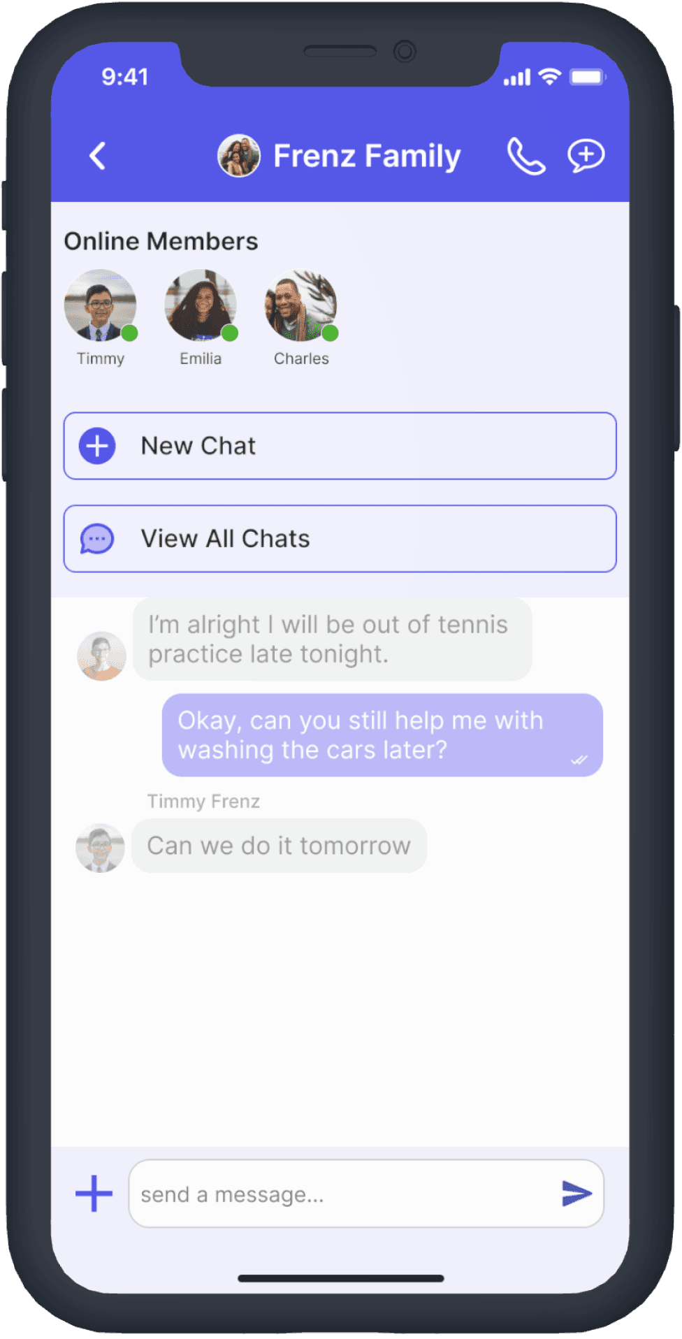
Solution
When users tap the button, an option for them to direct message online members, start a new chat or view all of their chats is shown.
Re-testing
Testing the new chat navigation again, the users liked that they had all of the options and did not have to go back to the main chat screen to navigate between chats.
Event List
4 out of 6 users could not find where to view new events they were invited too.
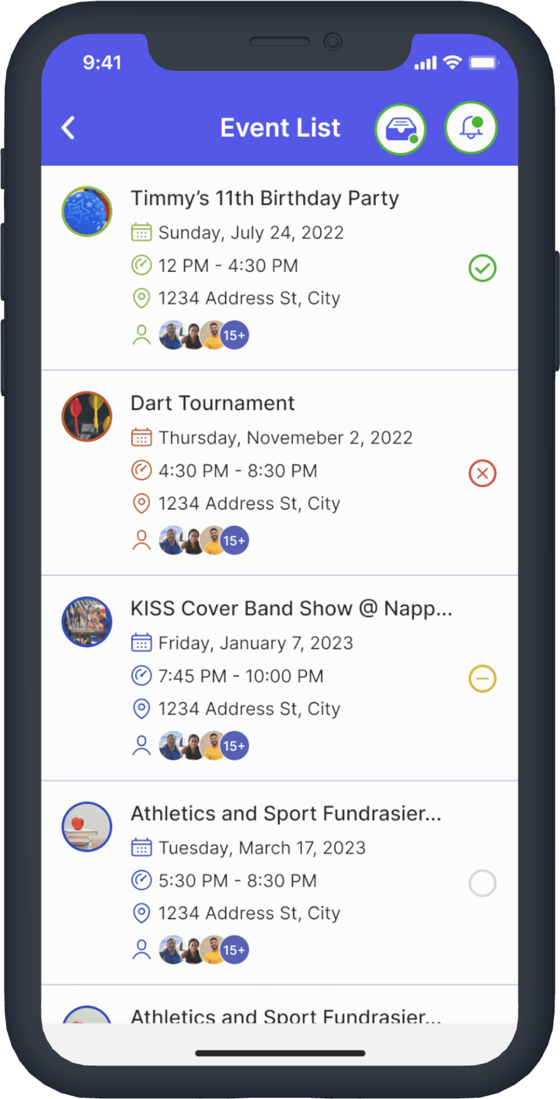
Solution
Re-testing
Testing the “Event List” lead to user wanting to see updates of their events as well.
Event List & Updates Re-Test
4 out of 6 users could not find where to view new events they were invited too.
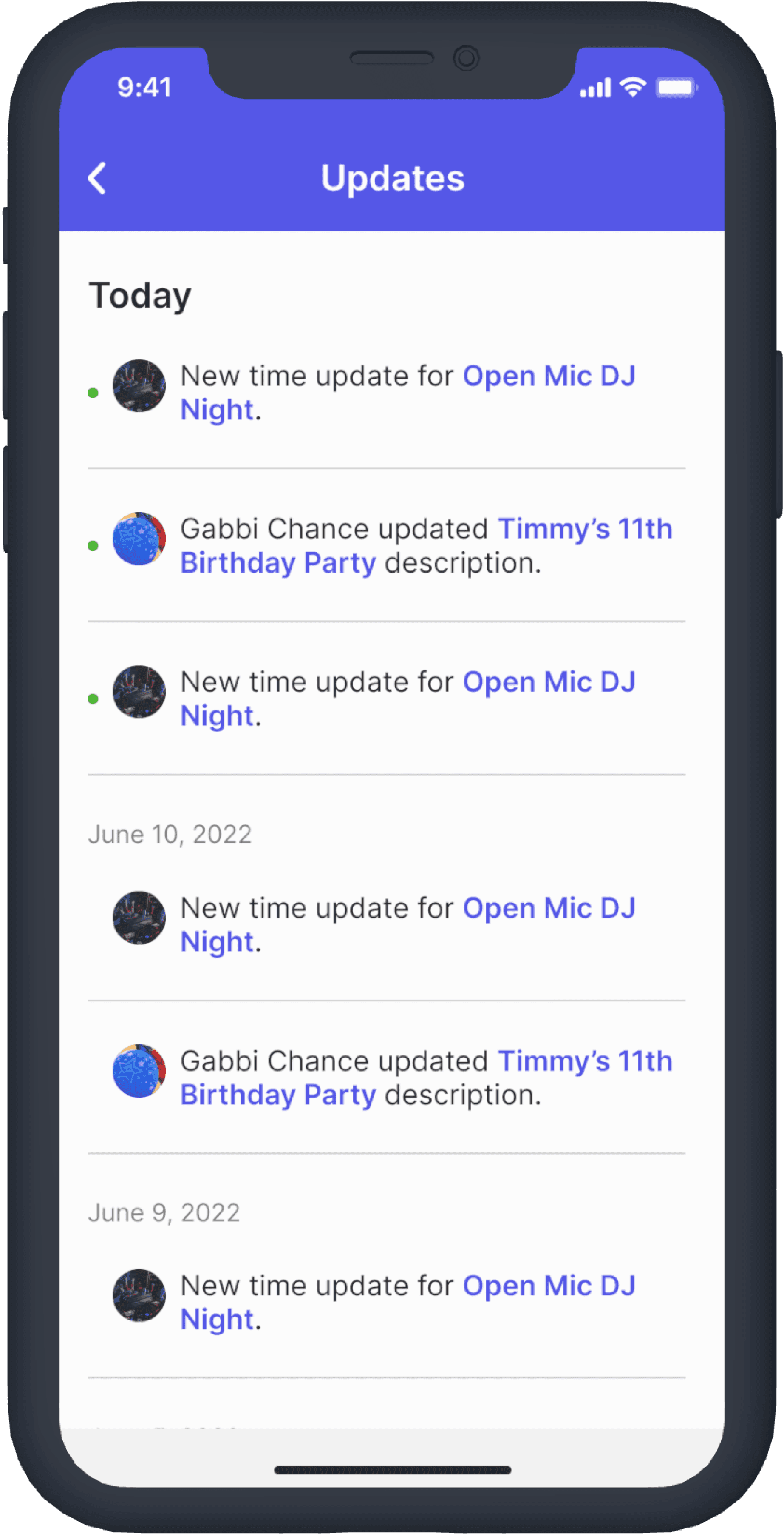
Solution - Event Updates
I decided to house the notification updates within the “Event List” for the user to access all of their event information within one space. Users will tap the icon to view the updates.
Re-testing
6 out of 6 of the users tested successfully completed answering an event within their “Event List”.
Delivery
Outcome

The second launch of the MVP has increased funding to push through for an iOS App store and Android Google Play release in Q1 of 2023.
Feature Roadmap
populating of times + dates available for All Cirkl Members
Populating Cirkl users schedules to be for event coordinators to create events that only times and dates everyone is available is a feature that would set Hello Cirkl apart from competing apps.
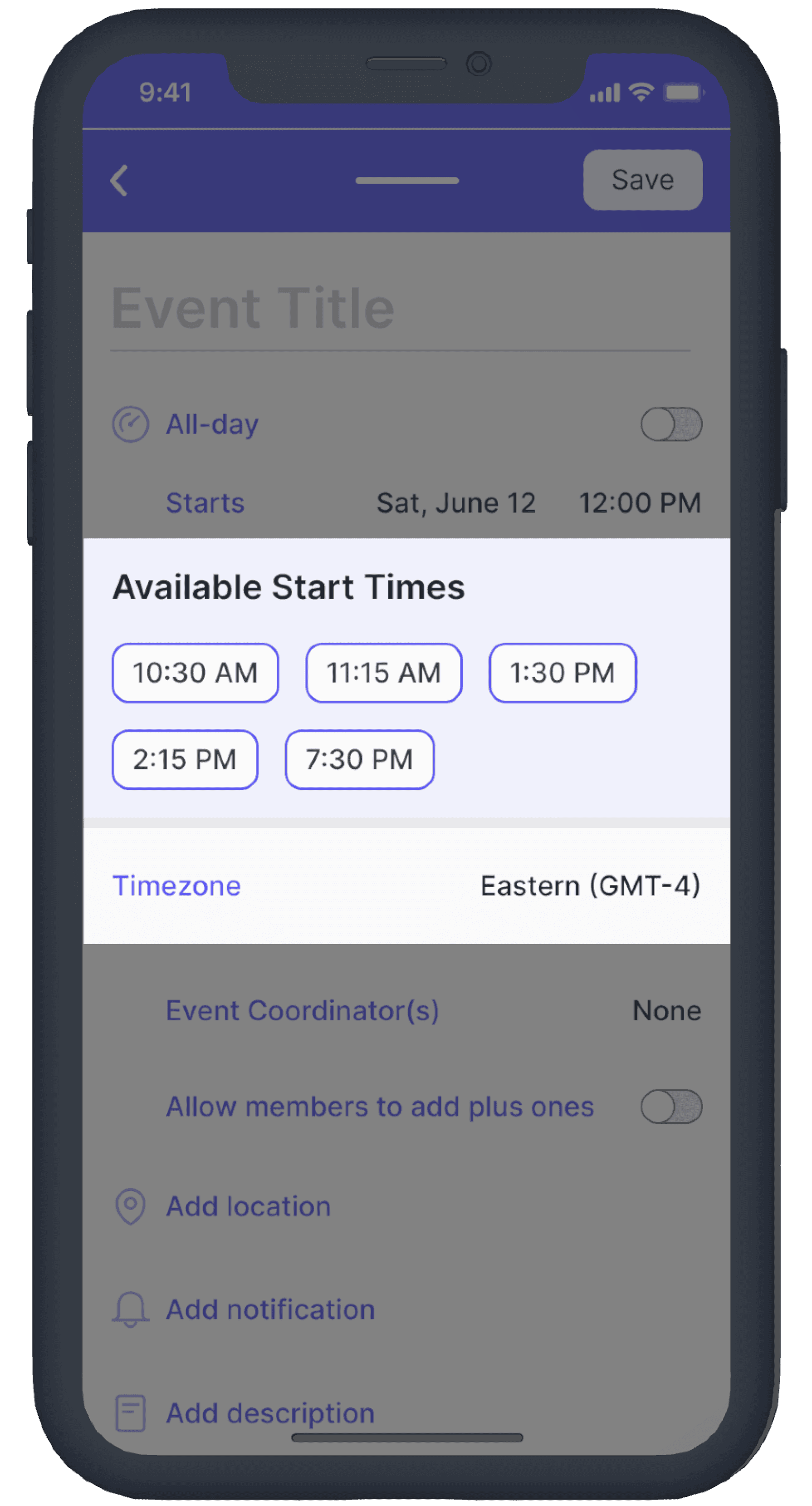
Hello Cirkl's current APIs could only do this with enough data stored from users so it is on hold for the future.
Pinned “Cirkl Stories”
To take inspiration from format story formats, used of social media platforms such as Snapchat and Instagram and utilize it in a way to keep up with each Cirkl’s updates and events.
Project Reflection
Things that I learned
Loom is an incredible hand-off tool
Getting to screen and voice record myself explaining the design flow in Figma saved time, money and stress when handing off files to the development team.
When creating for a wide demographic, designing without bias is key
This project entailed a wide demographic, different ages and backgrounds, each feature had to use clear CTA’s (call to actions) and strategic UX writing.


